#Security over usability
Unlike a commercial product that prioritises usability and business value, this government-initiated project prioritises security over usability as it’s about the digital identity of all citizens.
This case study focuses on the registration process of an authentication app that allows Hong Kong citizens to use the government verified digital identity to access different online services.
Background.
The 2017 Policy Address announced several digital infrastructure projects to support the smart city development in Hong Kong. One of them is providing an electronic identity to all Hong Kong residents free of charge, enabling them to use a single digital identity and authentication method to conduct online government and commercial transactions.
iAM Smart app serves as a single sign-on application for residents to conduct online transactions. Users do not need to remember multiple sets of login IDs and passwords to access different services. In addition, there are several sub-features like auto form-filling, notifications from subscribed government services and digital signing with legal backing.
I worked as a senior UX researcher. I partnered with another senior UX researcher, 2 interaction designers and 2 UI designers from Shenzhen.
Covid 19 makes this project a lot difficult than usual. It affects how we conduct co-design workshops with users. As most of the staff need to stay in Shenzhen, I need to work on this project independently.
As it's a government project, all the design needs to get through different levels of management from various departments (efficiency office, OGCIO, Immigration department, Legislative Council...etc.
And the biggest challenge is that I have no control over the marketing and branding direction, as another agency is responsible for that, and I can only communicate with them through government officials.
Challenges.
Mismatch branding style between the app and the marketing materials
Different vendors work on different marketing materials for this project without any design guidelines
What am I asked to do.
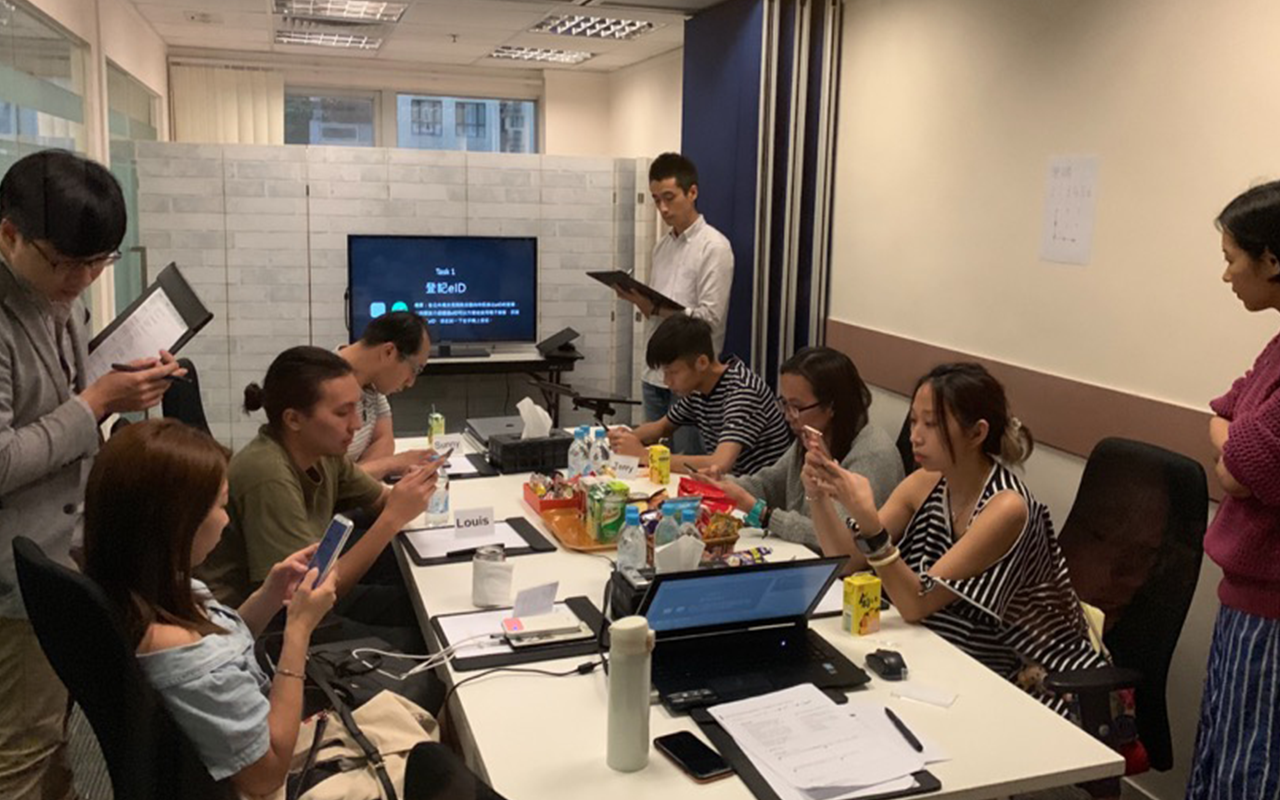
I was responsible for preparing and facilitating co-design workshops with users aged 11-75. The co-design workshop includes usability tests and interviews sessions. My goal is to make sure users can register and use the app without any friction, and top management can hear their suggestions to improve the app.
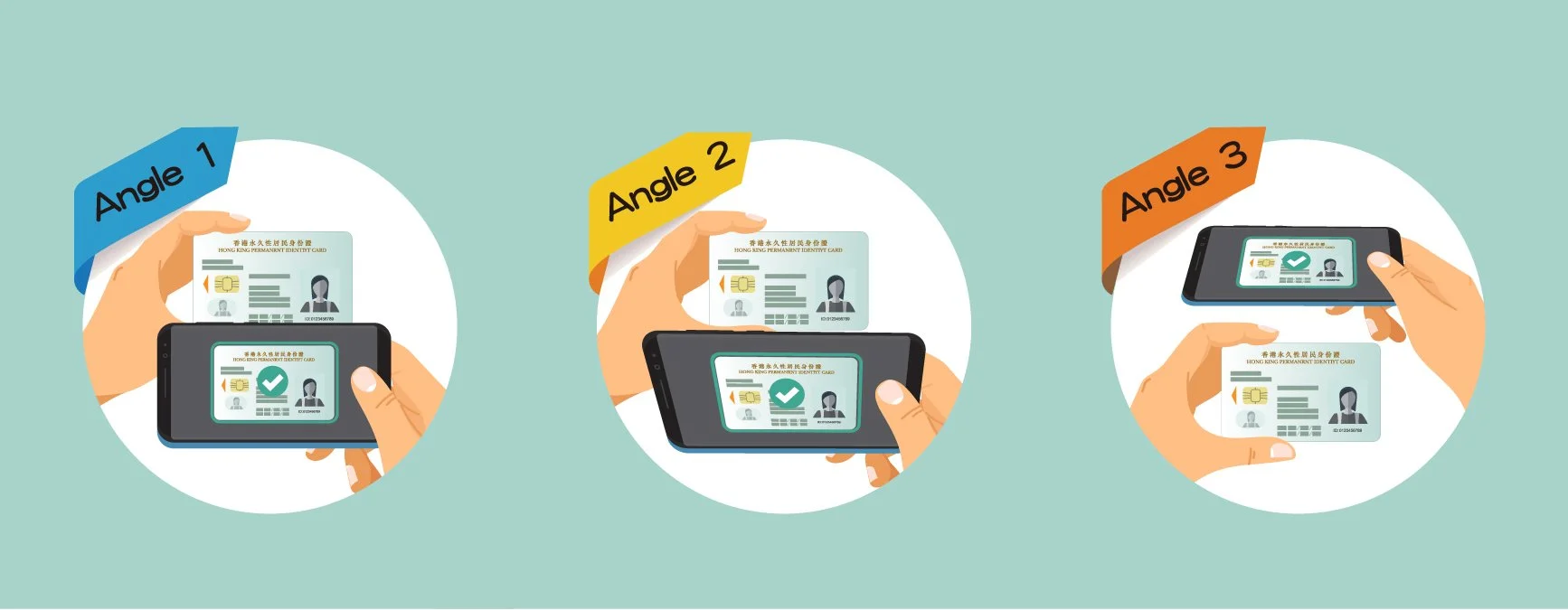
Different methods to scan the id card
Co-design workshops discovered the 2nd method, which can avoid the light reflection on the id card.
Different instructions for the facial recognition process
The app will send the images to the immigration department to match the database.
What do I FIRST inherit.
The app involves a complex scanning of ID cards and facial recognition for registration. It will be difficult for citizens over 50 and people with disabilities to get through that process. This complex registration process will strongly affect the adoption and usage figure.
Plus, it will take time for users to understand what and how to use an authentication app.
Research.
As the target audience's age range is broad, I need to make sure users with less mobile app's knowledge manage to register and use the app intuitively.
Conduct usability tests and compare the result with different ID card scanning prototypes referencing other virtual banking apps
Conduct usability tests and compare the result with different instruction and visual cues on the face recognition process
Conduct interviews with different age groups to find out the precise description for the app, which makes the general public can understand what the app is about
Communicate between government departments and tech team to make sure everyone understands the technical limitation on the registration phase
Conduct a role-play session in the kiosks and tablet venue to ensure the offline registration flow is smooth with the online flow.
Research outcomes.
No matter how we tweak the ID card scanning design, users aged 40+ find it challenging to finish the process. Some may even fail and cannot proceed to the next step.
Male users perform better using a 3d indicating spot, while female users perform better using the frame.
Users from all age groups feel taking 3 shots of an ID card from different angles are too much. But after they understand the app will serve as their id card digitally, they all think it's essential to go through the complex process to avoid their identity will be used by others.
One gesture instructions - "turn your head to the left and back to the centre" for face recognition encounters technical difficulties.
The AI cannot recognise when users turn their heads too fast or turn too much that the eyes have left the camera frame.
Citizens seldom use online government services. They will not start using the service from the one-stop platform -"mygov.hk". Instead, they will directly use the service from the service sites, which differs from the government's thought.
Comparison between two methods of scanning HKID cards for different angles
Most male users think the red dot reminds their gaming experience, making it easier for them to adjust the angle, while some female users do not understand the dot at all.
Users need to take around a minute for taking the first angle of the id card
Most users will ignore the instruction and demonstration gif.
Users need to follow 2 gesture instructions for facial recognition
Users seldom browse government service sites through "mygov.hk" (one-stop platform),
which differs from the government's plan.
How might we.
Create…
clear alternative flow
For…
users with less mobile phone experience and disabilities
To…
register the app on different platforms
And improve…
the adoption rate
Create…
precise in-app guidance on the registration process
For…
all users
To…
complete the registration flow intuitively
And improve…
the adoption rate and user satisfaction
Create…
comprehensive marketing materials and campaign
For…
general public
To…
understand the need for the security measures on registering the app, the different types of registration platforms for different users with different needs and how they can benefit from the app
And improve…
the adoption rate and NPS
Design.
As I have no control over product marketing, I can only suggest the government prioritise digital identity instead of the app's function so that the public understand iAM Smart is equivalent to their Identity card. Hence, the public will understand the importance of strict security measures on the app's registration. And the marketing material should be promoted by each different service platform when they roll out the iAM Smart functions.
I focus on redirecting users with difficulty registering in other platforms to insert physical ID cards or get assistance from staff for registration.
And I will make a few tweaks to the copy of the instruction to make sure users can register the app intuitively.
#precise in-app guidance on the registration process
From what we observe from usability tests, most users will ignore all the instructions and demo gifs. We have added audio guides. The audio guide can make the users less nervous and provide instant cues to reflect users' actions. Users will only look through the instruction if they fail at the first attempt.
#clear alternative flow
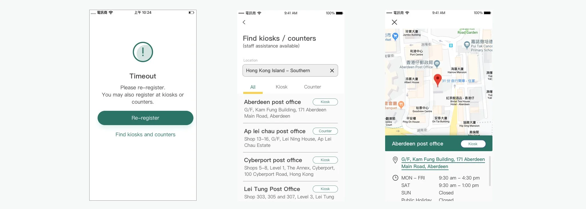
We have added a sub-feature for users to register alternatively. Once the users fail in any registration stages, the prompt will direct users to the kiosk and counter's location page.
Audio guides have been added to assist the registration process, and audio cues will be played along with the scanning session
Once the users fail in any of the registration stages, the timeout prompt will guide users to register in kiosks or register in counters with staff assistance.
Impact / hindsight.
The play store score of the app is just 2.9, and most of the users complain that it takes too long or even fail to scan the id card.
" The Office of the Government Chief Information Officer (OGCIO) announced today (November 15) that more than 1 million users have registered for the "iAM Smart" one-stop personalised digital service platform and over 160 commonly used government, public and private online services are now accessible through the platform."
Just like issuing a physical ID card, security is significant for an authentication app. With a good product marketing campaign, users will understand the need for the complex registration process. Besides promoting the importance of security measures for digital identity, the government should advise senior citizens and the disabled to register through counters and kiosks.
The definition of the product as a one-stop personalised platform does not comply with the regular user's journey, in which users will reach the service sites they need first instead of browsing the service from iAM Smart.
With a broad range of target audiences, conducting a qualitative interview is essential for senior citizens and the disabled as they have less experience in using smartphones.
#From offline to online
Digital transformation is an inevitable stage for business now. Letting go of forms, sending mails by post should be avoided nowadays. But when there's a chance to make this happen, it's better to revisit the flow and remove the redundant part instead of digitalising the original flow.
This case study about the UX research should not be omitted in the pre-design stage, especially in digitalising flow from offline to online.
Background.
HKEX developed a new platform called FINI (Fast Interface for New Issuance). It enables professional IPO market participants and regulatory authorities to interact seamlessly and digitally on all the steps that comprise the end-to-end settlement process for new listings in Hong Kong.
FINI will shorten the time gap between IPO pricing and trading, giving investors quicker access to new listings, reducing market risk, and improving efficiency for all parties involved.
I was the UX consultant from the development team, worked closely with the HKEX internal UIUX designer to improve the FINI platform's user experience.
Business intelligence is what I lack in this project as it's a b2b application process that involves the company's legal team, financial institution, HKMA (Hong Kong monetary authority) and SFC (Securities and Futures Commission). Even the internal designer does not have enough information, and he can only gather requirements from the internal business user within HKEX.
I stepped into the project in a post-design stage where HKEX had confirmed all the prototypes on Axure. And I was asked not to tweak any design and let the design get sign-off. But when I looked into the prototypes, there's a lot I can improve on the UI side even though the design was already following the material design.
challenges.
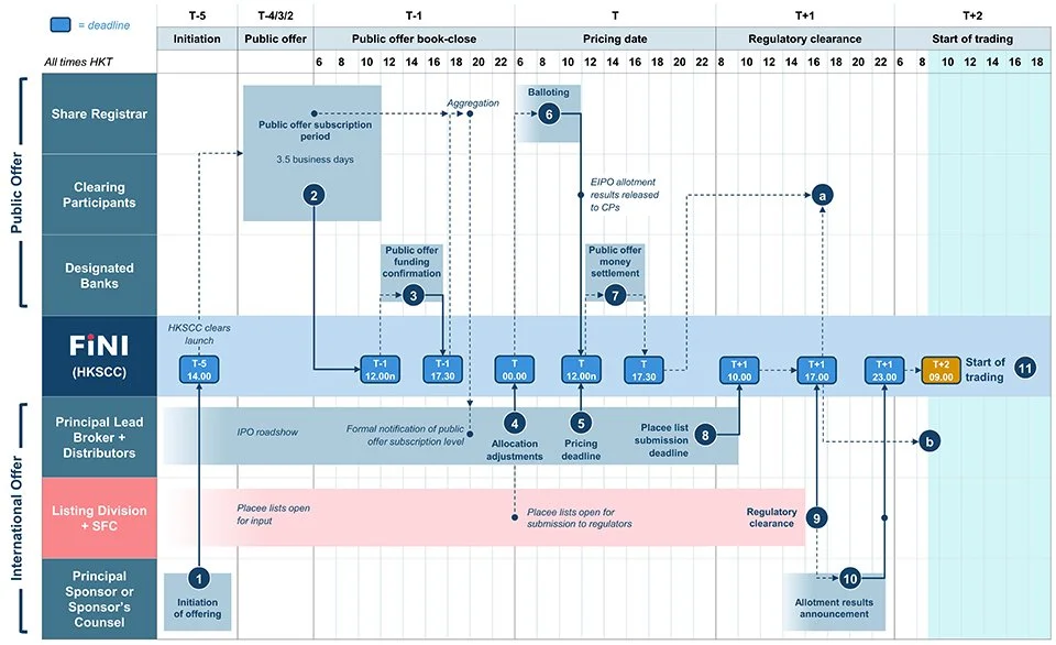
The above table illustrates how FINI improve the IPO settling process from t+5 to t+1.
What am I asked to do.
I was responsible for evaluating the UIUX design of the FINI platform prototype, which our client, HKEX, will sign off soon, and the development will start once I confirm with the design.
The platform allows companies to apply for IPO, and different regulating bodies can verify their documents online. Those parties used to do this offline process by mailing physical documents back and forth.
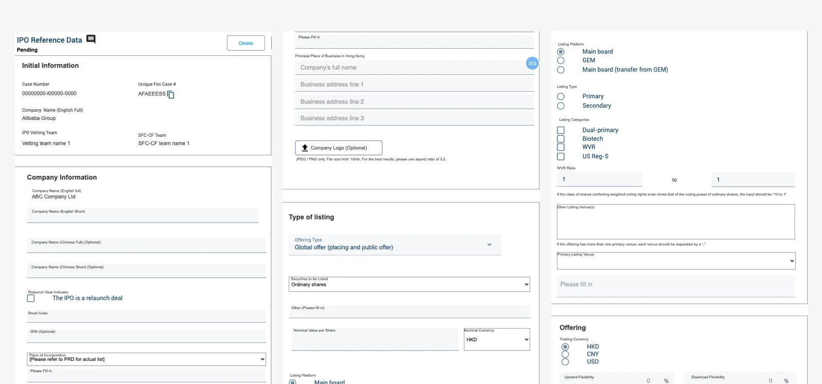
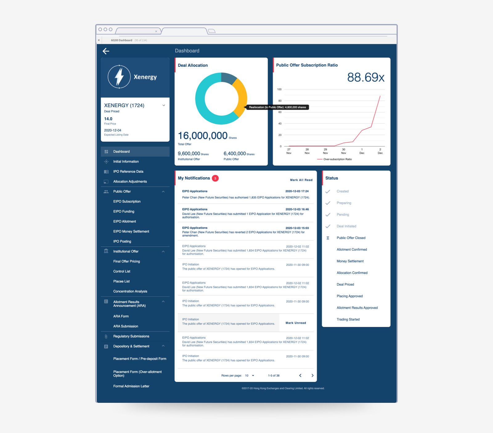
The original dashboard and IPO reference data page.
The IPO reference data page will include all the form fields (80+ form fields) from the existing paper form documents.
What do I FIRST inherit.
After looking at the prototypes and communicating with the designer from HKEX, I found out that they didn't conduct any interviews or workshops before working on the design. The team designed the platform based on the existing offline flow and requirements from HKEX and regulating bodies. They did not capture the user journey of the end-user - the legal rep from the company who want to apply for IPO settlement.
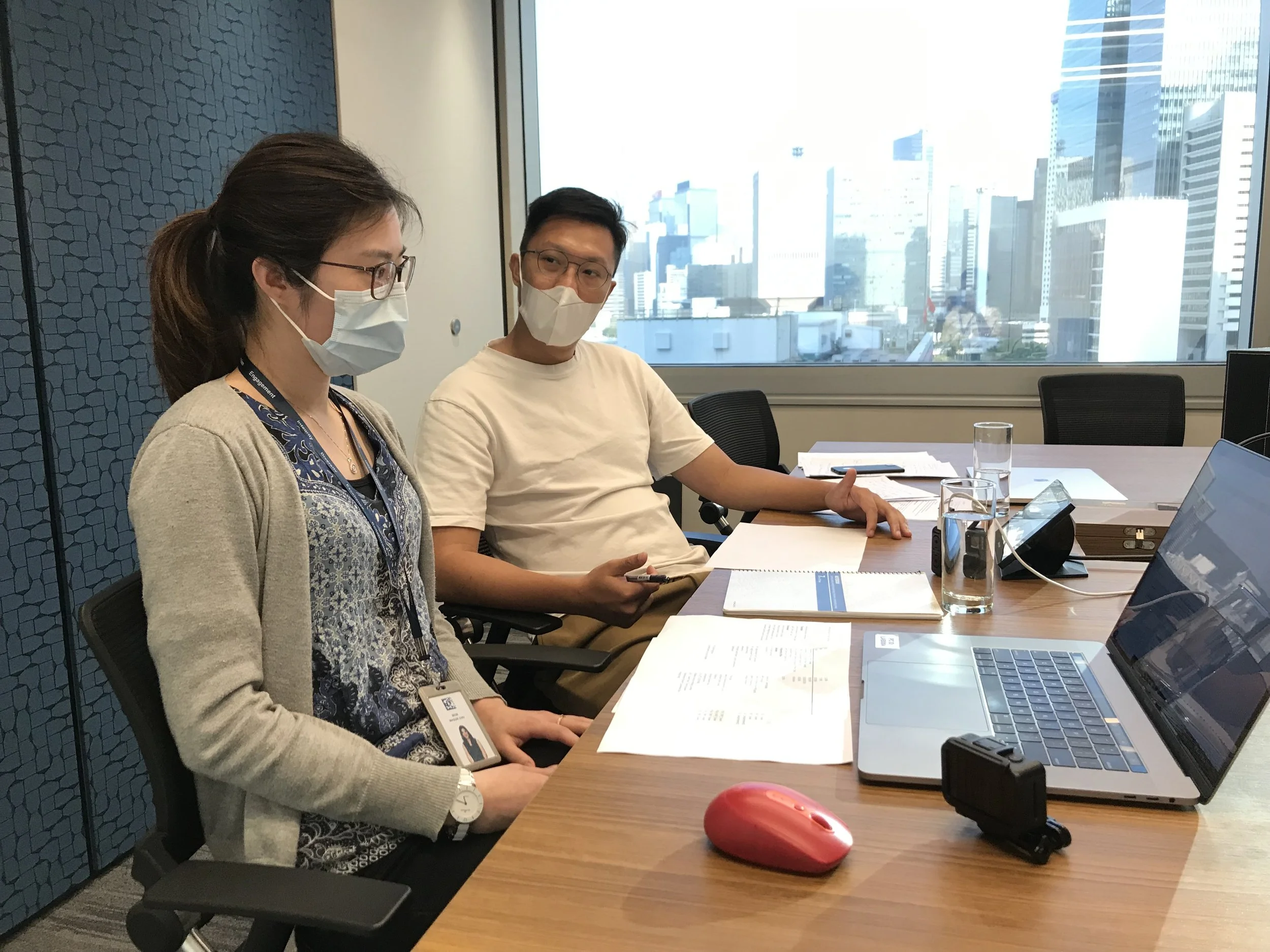
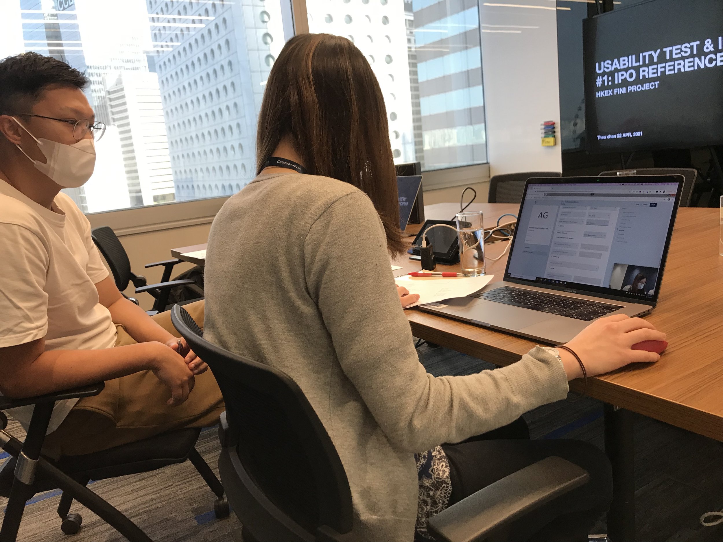
I decided to conduct an interview and usability tests before confirming the design to ensure the design was relevant to the end-user.
Research.
I should understand the platform's flow and gather more information from the end-user and business from HKEX.
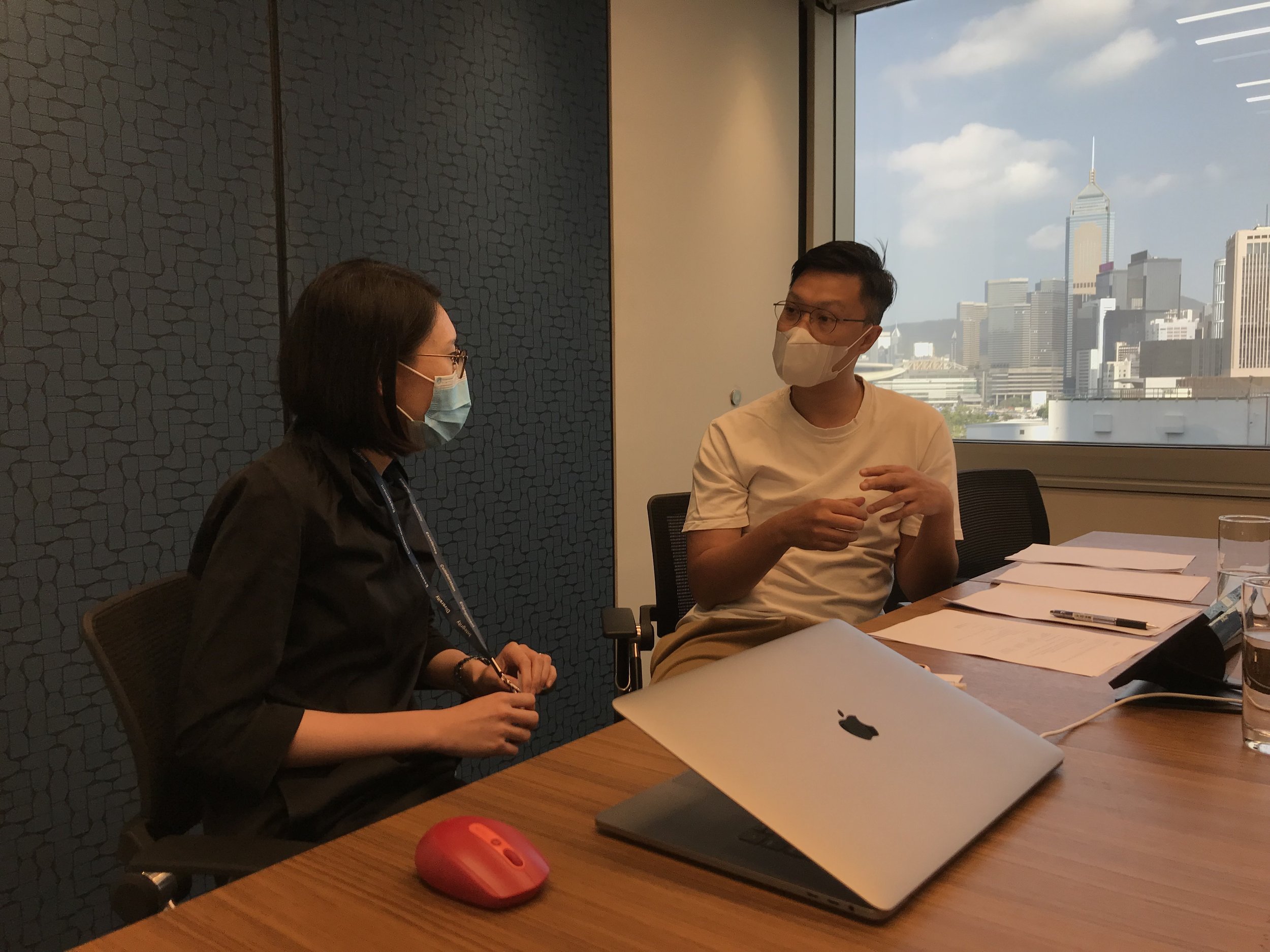
Conduct qualitative interviews with the end-users (Luckily, HKEX internal staff have worked as legal advisors inputting the form before. If not, we might need more effort to gather users from legal firms.)
Conduct usability tests on the form which end-users will submit to the regulating bodies with the end-users mentioned above
Have a walkthrough on the prototype with existing prospectus's information
Research outcomes.
We finally know who the end-user is and when the user will start working on the IPO application from the interview, which the internal design team has not discovered before.
The end-user is usually the assistant of the legal advisor team.
All the information they need to type is already ready from the prospectus. It's just an information entry step for the companies.
As it's a B2B platform for professionals, users will treat it as a job
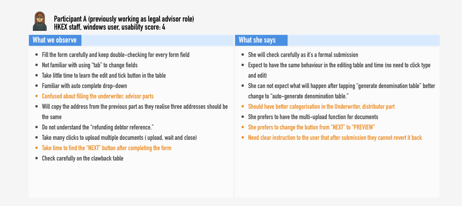
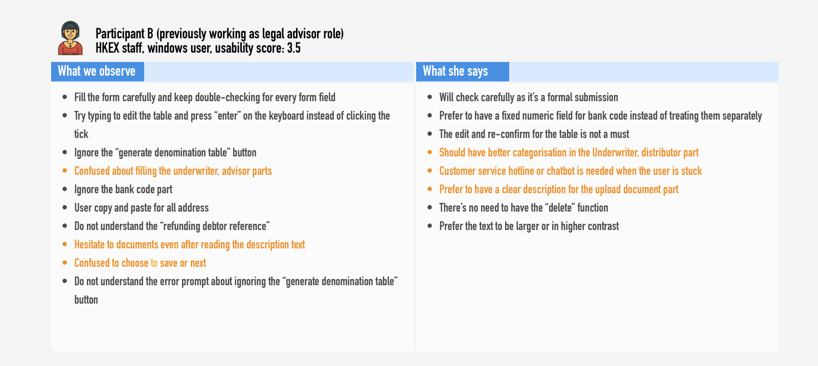
Users will be cautious about inputting all the information, and they will double-check the information on their own.
Users want to key in the information without using any mouse. They prefer to input them without using a mouse.
There are a lot of confusing fields and buttons' names for users.
They either include the redundant fields from the original physical form or add form fields that only benefits the internal team without considering the end-users
Several button names mislead the users (e.g., next, generate denomination table etc.)
Instructions are unclear. It misleads the users that they have a chance the revert the submission. But the fact is users do not have a chance to revert unless the internal team revert it for them.
Recruiting for the user entering the IPO reference data form is quite difficult as they are all the staff from other companies’ legal advisors. Luckily we can recruit internal staff with the same experience to conduct the interview.
How might we.
Create…
UX materials
For…
the team
To…
understand more about the end-users and their needs
And improve…
the user experience and impact of the product
Create…
an optimised and intuitive UI specialised for the digital flow
For…
end-users
To…
complete all the steps intuitively without calling for assistance
And improve…
the usability and efficiency of the platform
Design.
Although the prototype has been 90% finalised, there's still time for the design team to alter the flow and UI.
After the interviews and my evaluation, the internal design team from HKEX realised that it's essential to revisit the product with more in-depth interviews, which they haven't had before.
Besides working on the UI design, it's better to work on the basics like user journey and personas first, especially since several user types are involved.
#intuitive and optimised UI
After the usability tests, we have analysed the result and adjusted the overall design system with font size, font hierarchy and colour contrast. We have adjusted a lot of UI copies as the previous ones are not aligned and confusing to the users especially for the action buttons.
Impact / hindsight.
This project gives me an excellent opportunity to introduce the importance of UX for the success of every product. As a consultant, I forced the first interview and usability tests for the product. And the result is so promising that they want to revisit all the flow before signing off all the requirements to the development team.
The internal team has worked very hard on the design with the requirements from different professionals for nine months. They have used a design system referencing from google material design. But all their hard work doesn't pay off. Without good UX work (interviews, working on the user journey and auditing the original offline flow), the product can not meet users' needs. The platform cannot solve the existing problem from the original flow.
When we talk with leaders about what they mean by digital, some view it as the upgraded term for what their IT function does. Others focus on digital marketing or sales. But very few have a broad, holistic view of what digital really means.

#Atypical ordering pattern in Multi-level marketing
In MLM(multi-level marketing), ordering is a JOB. Distributors need to place order strategically every month to enjoy the passive income and maximise their team's bonus.
This is a case study about shifting the product focus from an e-shop for customers to an ordering calculator for distributors.
Background.
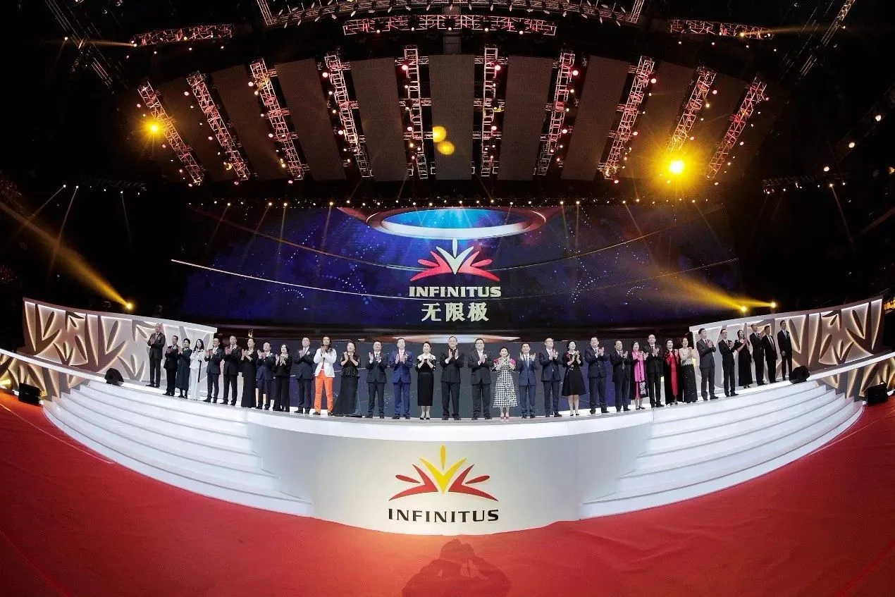
Infinitus was the No.1 direct selling company in China, recorded 213 billion sales in 2017. It focused on the Chinese herbal supplement and property investment.
With the great success of selling Chinese herbal health supplements in the China market, the company planned to expand the business into the overseas market.
I was the lead designer, working closely with the product manager, marketing manager and engineers for the overseas digital direct selling model.
Guangzhou Infinitus plaza designed by the world-renowned architect - Zaha Hadid.
What am I asked to do.
I was asked to design an e-shop for each overseas distributors to sell products to consumers and to order products on their own so that we can expand the business globally without setting up offices, shops, and outlets.
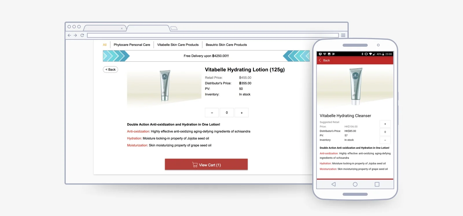
The original ordering page in the internal member site was purely designed for distributors.
(limited product details and limited functions)
What do I FIRST inherit.
I should add detailed product information, testimonial, instructions for consumers, especially foreigners do not have prior knowledge on TCM supplement. Besides, I should add sections on our brand, research, award, and TCM to convince the consumers.
Research.
I should understand how direct selling business works and their ordering pattern.
Conducted qualitative interviews on ordering pattern with the distributors in Hong Kong
Gathered requirements and comments from the marketing team and potential distributors in Canada
Conducted several workshops with local office and CS team to gather feedback
Empathise - join competitors' business platform (pruvit, ariix, doterra, nerium…etc) to understand online direct selling business in the US and Canada.
Research outcomes.
Offline operation is indispensable in MLM business as they are selling trust more than the products.
Distributors prefer giving the products from their inventory to customers in person so that they can build trust with them and guide them on how to consume the supplement.
Retail tiers are the least focus in MLM business.
99% of the revenue comes from distributors especially those in the fast-growing team, not from consumer
Distributors look for business partners, not sales.
Distributors placed orders for maximising team bonus, not for products.
Senior distributors would have a meeting on ordering strategy every month. After the meeting, they will instruct their downline how much they need to order.
Above diagram illustrates the ideal flow of the e-shop before research.
The shop is designed to gather sales and get new leads online; distributors only need to pay effort on customising the website and money for the online advertisement.
Above diagram illustrates how distributors work on recruiting new leads.
Offline operation is so essential for the recruitment process as it builds relationship and trust to the potential customers. These potential customers will get a more significant chance to become their business partner and help them to expand their team.
How might we.
Create…
A better ordering “calculator”
For…
Distributors
To…
Plan the ordering amount to maximise their bonus at ease
And improve…
their working efficiency and team planning efficiency
Create…
An online catalogue
For…
distributors
To…
introduce our company, products, and TCM to their potential customers at any time anywhere through IM and SNS
And improve…
their recruitment efficiency
Design.
Ordering for consumers would not be the main focus, the website would act an entry point for potential distributors to know our brand and try our their product.
The design will be focused as an online catalogue and ordering for distributors.
#Online catalogue
A well-designed online catalogue with company background can help to build trust to potential consumer or business partner for the distributors.
The additional product details are essential for consumers to know more about the product.
The landing page consists of the following parts
(i.e. TCM knowledge, company, opportunities for joining our business, key products, and distributors’ contacts)
with customised header and personalised message.
Product images and comprehensive product details have been added for consumer tier.
#Ordering
The normal e-shop flow is kept for consumer tier. Consumers can still browse the form the product list, click into the details, add products in the cart and checkout.
Once the distributors log in, they can enjoy a quick ordering flow. They can check out from the product listing page; they do not need to get back and forth from the product listing and detail page to finish their bulk order.
A bonus point, price and free delivery status modal have been added for them to calculate the best product combination to maximise their bonus. (They used to do it with paper and pen)
A share cart function has been added for team leaders. The senior members can assign their downline what they need to order that month to maximise the team bonus and promotion plan.
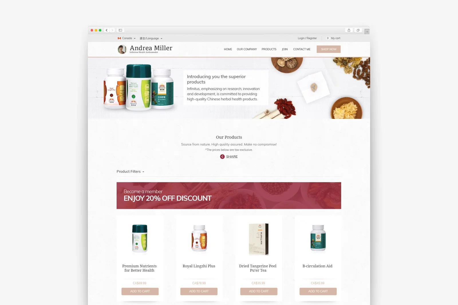
Product listing page for non-distributors consists of a recruitment banner and grid view of products.
Consumers will follow the common ordering flow(i.e. product listing > product details > cart > check out)
Calculator modal, quick checkout, and share cart function have been added to target the distributors’ ordering behaviour.
Impact / hindsight.
Usage of the platform increased by 68.9% although the ordering amount only has a slight increase of 10%.
Moreover, the new platform scored 8 in Net Promoter Score. Distributors agreed the platform had successfully helped them to introduce TCM to their potential customers.
(The figure is comparing with the average figure before launching the new platform)
#Delayed dashboard and legacy system
In MLM(multi-level marketing), distributors will not be successful by only selling their product. They need to get several levels of downline, so team management is a significant job for senior distributors. The dashboard is the only way they can monitor their team performance. And a live updated dashboard is the most important thing, especially near the cut-off date.
This is a case study about designing a workaround solution for the legacy delayed dashboard and improving user experience with search, filter and notification function.
Background.
Six team leaders in Infinitus China are earning 100mil RMB monthly by managing and coaching their team.
As any distributor’s bonus will affect their up-lines’ bonus, it needs a lot of calculation to update the whole system. And the system is designed back in 1992 which were not intended to meet the current business growth, especially for global expansion. Distributors are all suffering from the delayed and raw dashboard.
The dashboard includes:
personal ordering bonus
group ordering bonus
team ordering bonus
recruitment
team performance (team management)
I was the lead designer, working closely with the product manager, marketing manger, operation manager and engineers for the overseas digital direct selling model.
Team leaders and director were celebrating their success in 2018 annual conference held in The Venetian Macao.
What am I asked to do.
I was asked to redesign the business platform for senior distributors to manage their team efficiently so that they can spend more time on offline training and expand their team.
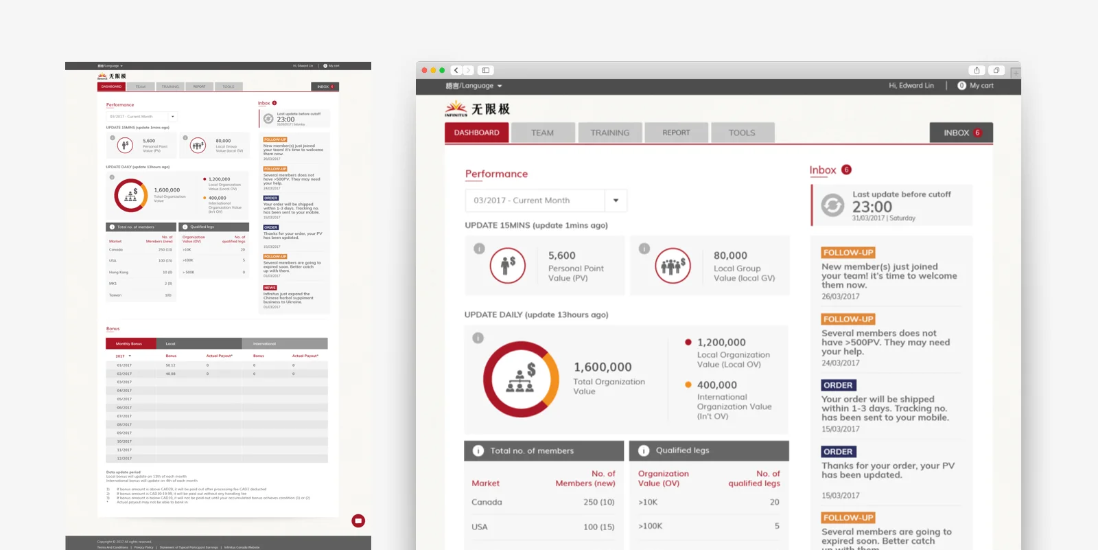
The original dashboard is not designed in from user’s perspective. It just lay out al the data available without organising it.
What do I FIRST inherit.
For the dashboard, I should re-organise all the data in a user-centric way so that distributors can get what they want to see in a glance. Most data were organised for the internal operating purpose.
For the team performance, I should add a search function for them as they were looking at 200+ records and even most of them are hidden in different level tabs.
Research.
I should understand how the team leaders look at the dashboard and team management page and the insight they want to know from these figures.
Conduct interviews with the distributors in Hong Kong, knowing their workaround towards the system
Get requirements and comments from the marketing team from all existing local market
looking at the usage figures of all digital platforms
I should know the technical boundary for the new platform.
Gather information from programmers and engineers on the API of the centralised calculating system based in China
Research outcomes.
Distributors did not trust the dashboard figures.
The Figures were not updated instantly after each transaction.
Some distributors complained that they had lost bonus because of the misleading figures from the dashboard, especially near cut-off date.
The dashboard had usability issues.
Junior distributors did not know how to retrieve the data they want from the dashboard.
Senior members wasted a lot of time browsing the team performance page.
Senior distributors used several hours every week to toggle through each record one by one to see if they had potential downlines.
There were technical problems for the instant update and dealing with time zone.
the system for calculating bonus would have an 8-hour downtime at midnight (GMT+8)
Figures were updated in different frequency (i.e. 15mins, 24hour)
Above diagrams show distributors’ goal in different stages and what they are looking for the dashboard and team performance page.
The dashboard guides them what they need to do to expand their business. A better-designed dashboard can improve distributors’ working and communication efficiency.
“there is no way we can fix the update problem as no one can bear the risk of screw up the system. It’s about $230billion business.”
How might we.
Create…
Update notifications
For…
Distributors
To…
be notified when the figures will be updated after each transaction and when they should make those significant transactions
And improve…
their working efficiency and communication efficiency
Create…
follow-up notifications
For…
Senior Distributors
To…
be notified which member(s) they need to contact
And improve…
their working efficiency and communication efficiency
Create…
A search and filter function in team performance
For…
Senior Distributors
To…
find the potential team or team member at ease
And improve…
their working efficiency and the chance of expanding their business
Design.
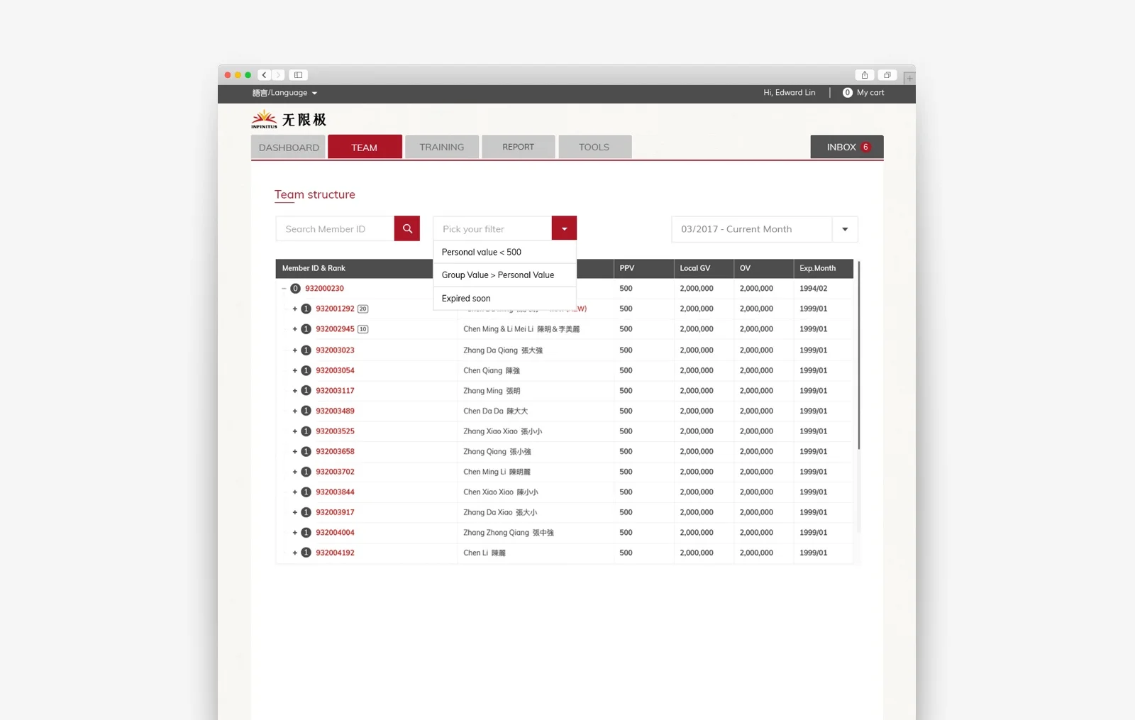
Search and filter functions will be added in team performance page to help distributors to retrieve their wanted data efficiently.
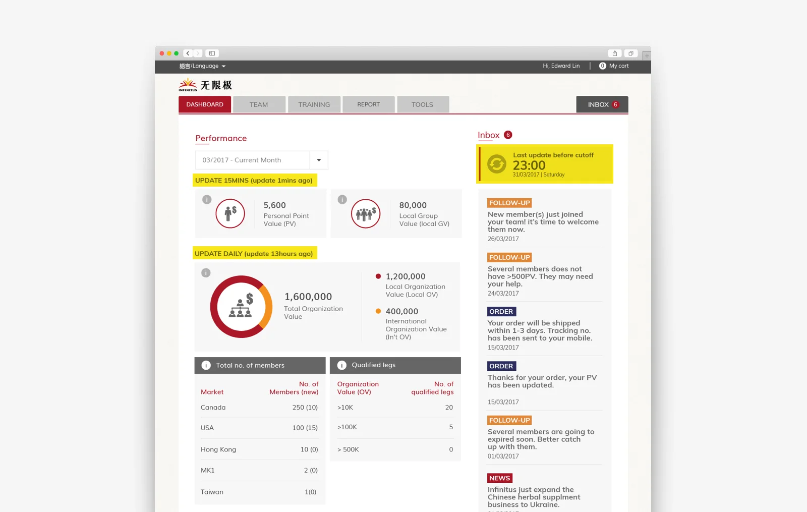
Follow-up notifications would be added to reduce their time for manual checking.
Last update time before cut-off would be added to reduce the inconvenience and the confusion of the update frequency.
Besides, the presentation of the raw data would be redesigned.
#Search and filter
With the search and filter, distributors do not need to browse their members one by one; they can search by their ID or get a filtered list(i.e. PV<500, GV>PV, Expired members) at ease.
Other than the individual member details, it’s more important to view his team performance and his direct sponsor.
#Follow up notifications
Distributors should focus more on getting new potential business partners, expanding their team via training. With the notifications, they can save a lot of time browsing the dashboard and calling the customer service. Notifications on ordering will inform them their transactions are successful and their personal value is updated. Notifications on monthly follow-up will save their time checking their members from the team performance.
#Last update time before the cutoff
This method is how experienced distributors worked in China. They understand the problem of update frequency; they will suggest all their team member finish all the transactions before that particular date and time. And the update frequency and last update time has been stated.
#Organised dashboard UI
Distributors can view their data in one page without browsing back and forth from different tabs.
Impact / hindsight.
User satisfaction rate increased from 58 to 83.
95% of user switch to the new platform (parallel with the old system)
80% of the distributors respond to the inbox notifications. And they agree that the inbox can save a lot of their time browsing the dashboard.

#Social intranet for employee portal?
Social intranet is Facebook for work. It can help to create a more connected working environment, but it needs engagement from the colleagues at all levels. For a social intranet to be successful, we need the change in company culture.
This is a case study about shifting the product from social intranet to a practical internal portal.
Background.
LKK Health Product group is the mother company of Infinitus (direct selling company), Infinitus Property Investment, Tianfanjian (TCM herbal production), HeHa (startup focusing on Health tech). The total number of employees is over 8000.
With the group chairman's new focus on digital transformation, the China division has hired Microsoft vendors to build a brand new portal leveraging the functions from Sharepoint. But it turned out to be a total customised site without any Sharepoint functions.
I was the lead designer, working closely with product manager and engineers for bringing the Sharepoint back and redesign the whole portal in a modular approach for the overseas employee.
What am I asked to do.
I was asked to design an internal portal based on the Microsoft Sharepoint template for overseas colleagues. And I was asked to incorporate the social features into the portal.
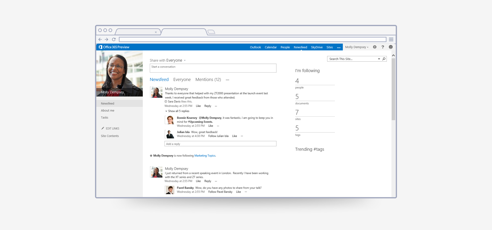
The mainland portal was designed with customised components, and it did not leverage any of the Sharepoint services.
Most of the components cannot be re-used.
Social sharing function allows colleagues to share, reply and like posts just like Facebook.
What do I FIRST inherit.
Social intranet maybe great for the millennials and startup but I do not think it is feasible in a Chinese corporation with a long history. Without any change in working behaviour, the intranet will be an empty network.
In this case, I will focus on helping colleague from different departments to get their job done(i.e. applying for IT equipment, applying for vacation, reimbursement, booking meeting room…etc) at ease.
Research.
I should understand their common request from internal support department(i.e. administrative department, HR department, IT support department, finance department). What is the core function they need from the internal portal?
Conduct interviews with colleagues
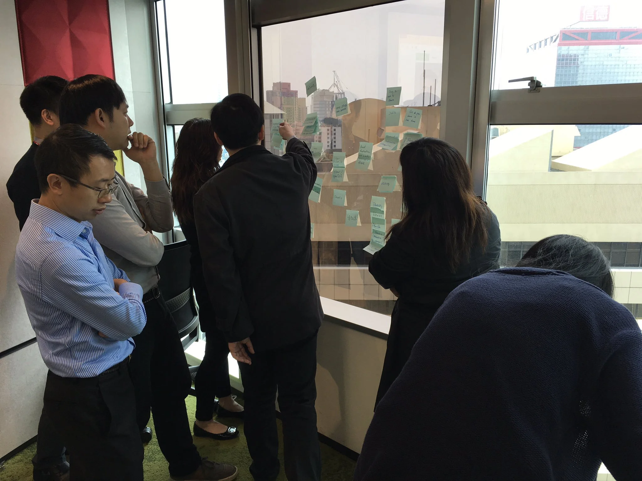
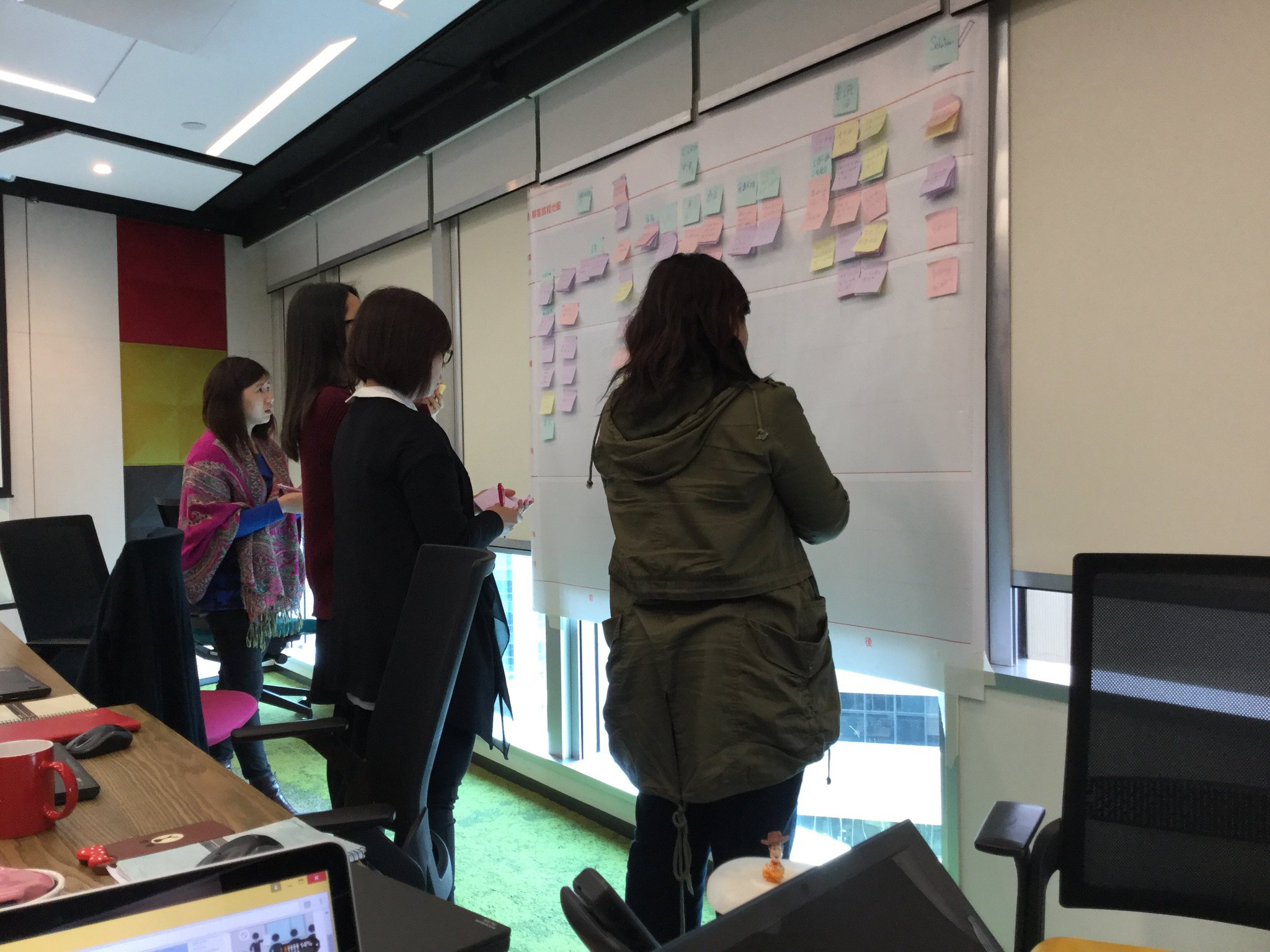
Conduct workshop with administrative department HR department and IT department
I need to know where I can improve from the previous workflow and the technical boundary of Sharepoint.
Gather feedback from colleagues
Gather information from vendors, programmers and engineers on Sharepoint customisation
Research outcomes.
Colleagues would not engage in the social intranet unless it’s compulsory in their workflow.
None of the colleagues changed their profile information since they get into the company. Information is all set by the HR department.
Colleagues prefer to use Slack, IM, emails or other project management tools for communication.
Service sites are not centralised and difficult to access.
Service sites are scattered around with different login and password. Colleagues need to access various sites by memorising the links, check that from the orientation HR printout or asking from other colleagues.
Internal support Departments needs a site to store relevant information, manuals, event photos and forms.
Support departments are still putting everything in a shared network drive which is very difficult to access.
Everyone is relying on an HR folder or accessing the network shared drive to find contacts, seats, passwords…etc.
How might we.
Create…
A personalised workstation
For…
colleagues
To…
get their job done at ease, access different systems at ease, search what they want at ease
And improve…
working efficiency
Create…
A modular site templates
For…
departments
To…
set up their homepage to store public information and publish news
And improve…
communication efficiency, working efficiency, and cost efficiency
Design.
After liaising with the product owner, we have decided to take out the social sharing part. We will focus on creating a centralised tools hub for our colleagues in a ‘done and run’ approach.
The personalised workstation will be equipped with a customised menu for different department’s staff, or they can personalise it on their own. And the global search would be their second components to get their job done at ease. Besides, they can access all Microsoft 360 software from the top right icon.
The modular site templates were easy to set up for different departments; they can add the pre-designed web parts they want and edit the page contents at ease. It is not only available for department page, but it is also available for project page.
# Personalised workstation
Colleagues can access all the systems by single sign-on. They can access different systems and departments from the customised left menu.
The homepage is designed as a personalised workstation rather than a corporate news broadcast site. Colleagues can access their documents, contacts and to-do list.
Or they need to search anything they want through the global search provided by Microsoft service.
#Modular site templates
Several pre-designer web-part has been designed for departments to set up their sites at ease.
Administration department page is designed with six web-parts. Documents are kept for temporary use while they are not ready for digital forms and workflows.
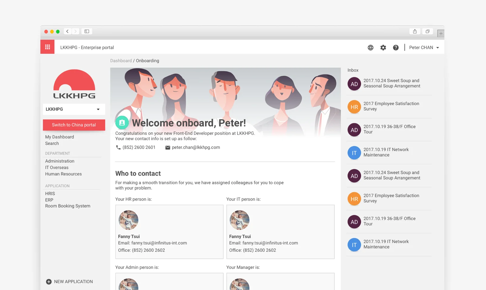
The above page is an onboarding project page designed for the HR department. And the whole page can streamline a lot of process for the HR department, IT department and Administrative department. With the new portal, they can get rid of the HR orientation folders too.
Impact / hindsight.
Mainland portal is planning to adopt the new overseas portal design.
The internal portal scored 8 in (NPS) net promoter score from departments managers and operating colleagues. And this increases their efficiency and cut down a lot of their cost.
And it also scored 77.8 satisfaction score from overall staff in the pilot run.


